Goodreads
- A heuristic evaluation and redesign of Goodreads, a website for readers to share, keep track of, and discuss books.
Project Type
Individual Project
Research Project
Role
User Researcher
UX/UI Designer
Timeline
September 2025
Tools
Figma
Notability

Project Summary
The problem 🚩
The website suffers from an inconsistent UI with glaring usability issues, impacting how users learn and experience the site's functions.
The users 👥
The users are Goodreads users, who are more likely to be women from the United States, according to a blogpost by T.J. Slee.
Primary goal🎯
The goal is to update three Goodreads pages so users can effectively:
-
See what others are reading/reviewing
-
Manage their book database
-
Discover new books
Heuristic Evaluation
Methodology
This evaluation was done using Nielsen's Ten Heuristics, and accompanied by severity ratings and recommendations for solutions.

Severity Ratings:
Heuristic #1: Visibility of System Status
Prevalence of visual feedback
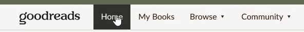
Hovering over navigation elements change button appearance, making it so the system responds to user actions.
No urgency in Call-to-Action UI Elements
Under “Giveaways” in genre pages, the design elements to represent urgency do not stand out.
Solution: Making these bolder, or colorful make these elements more eye catching/engaging.

Heuristic #4: Consistency and Standards
Inconsistent brand design system
Buttons, heading styles, and page titles are inconsistent across the website.
Solution: Creating a design system/kit is vital to maintain consistency.

Missing user flows
“Genres” choice in the navigation is missing on some pages, and present in others.
Solution: Ensuring that all flows are consistent across all page = easier to learn for new users.


Redundant pathways
Certain functions have two different pathways, causing the site to be cluttered with an unnecessary amount of buttons
Solution: Choosing an easier path decreases clutter, making the UI less daunting.
.png)
Heuristic #5: Error Prevention
Use of error messages
Before deleting a book from your list, there is an error pop-up warning the user, which is a great way of warning users about risky actions.

Default button is prone to mistakes
To log a book you have read, you need to click the dropdown, separate from the “Want to Read.” When making my account, I misclicked this multiple times and had to take extra steps to undo my action.
Solution: Making one button as “Log” / “Save” leaves less room for slips.

Heuristic #7: Flexibility and Efficiency of Use
Some editing functions have odd paths
You cannot edit book progress through your profile, you can only do so on your homepage.
Solution: You should also be able to edit book progress on your profile/book collection.

Unresponsive web design
Some pages (Ex. the Explore page) cover elements when minimizing the screen size. Hindering user experience on smaller screens.
Solution: Elements should scale properly to still show up on smaller devices. Web design should use different breakpoints to better accommodate to user needs.

Heuristic #8: Aesthetic and Minimalist Design
Lack of text hierarchy
“My Books” settings are hard to read, the text is small and the section is cluttered.
Solution: Ensuring sub-headings and body text is different sizes helps organize information for users.

Redesign
Style Guide

Homepage - Before

Pros & Cons
Ability to edit book progress from the homepage
Ability to customize your feed
“View All Books” “Add a Book” and “General update” are important call to actions but are too small.
"Goodreads Choice Awards" is not that important when voting is not active.
Can utilize more icons to supplement buttons
Home Page - After

Changes
-
Removed redundant pathways in the top nav.
-
Put Recommendations as the first element as an engaging way to discover similar books.
-
Inserted easily accessible buttons to important pages
-
Changed “Want to Read” button to “Save book” to decrease user error
My Books Page - Before

Pros & Cons
Many options for displaying and organizing collection
Outdated design
Overwhelming amount of buttons visible
Settings need to be condensed
My Books Page - After

Changes
-
Turned column view into cards, which would increase in height depending on the visible info.
-
Settings are shown but condensed into dropdowns.
-
Reading Activity/Add Books/Tools are all under “More options instead.
-
Search bar is dedicated to finding books in your collection
Explore Page - Before

Pros & Cons
Hosts recommendations based on the books that you have saved.
Highlights for News & Interviews
Too similar to “Recommendations” page
Does not stand out as an Explore page - should highlight pages better as a first step for a user to find more books.
Explore Page - After

Changes
-
Acts as a first step if someone wants to find more books.
-
Highlight reel shows highlights for three different pages someone can find more books.
-
Details of books appear on mouse hover.
-
Choice Awards and Genres have a highlight on the explore page too.
A Reflection
While this project was not an 0 to 1 product design project, it was still a great opportunity to do some observational research on a platform people use in their day-to-day lives. If I would measure the success of this project and its redesign, I would measure it through CTR of significant call-to-action UI elements and also view the bounce rate. As of now, I am proud of this project for helping me familiarize myself better with heuristic evaluations and also responsive layouts on Figma.
A Positive Outlook on the Design Process
While I did not have the time to do proper research, I conducted some usability testing sessions with acquaintances to affirm my evaluations on some of the usability issues in the Goodreads platform. I also presented my findings to other UX/UI and Product Design peers, communicating my ideas and effectively presenting my takeaways and redesign.
I'm honing some extra skills in UX/UI, like sticking to a consistent brand identity/design system, and it is definitely more convenient. Who would have thought?
Aside from the other takeaways, I really liked the color palette, green is my favorite color, and I felt the earthy-sage green tones fit with a modern redesign of Goodreads.
Next Steps
In the next project, I would definitely like to continue to practice presenting my work, and also continuing to use design systems and responsive layouts. A lot of UX/UI is based on accommodating to different breakpoints, so it is extremely beneficial to have that knowledge for my career.