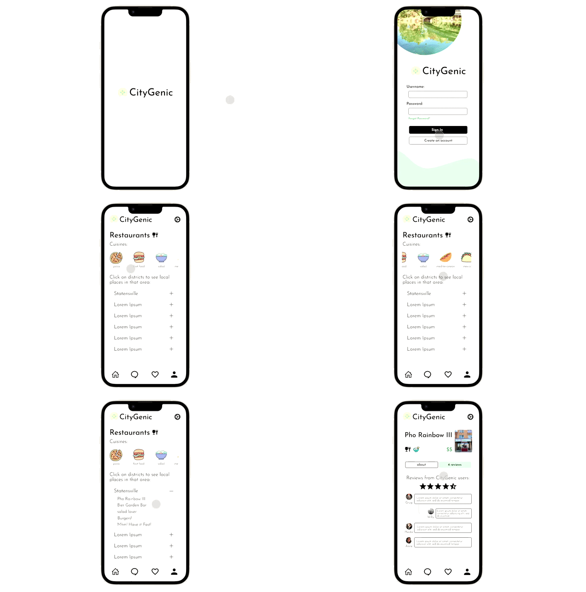
CityGenic is a social networking and informative application tailored for users to find attractive and trendy places utilizing dropdown lists of districts within cities.
CityGenic

MY ROLE
This project was the final project for a Human-Computer Interaction course and focused on the design process. I was the designer for the sketches, low-fidelity prototype, and high-fidelity prototype.
HIGH-FIDELITY PROTOTYPE


Chats and Notifications
These pages are a part of the primary navigation pages. The Chats page serves as a social discussion place, and Notifications showcases activity received on posts.
Restaurants Pages
These pages were split to preserve an organized design structure and maintain useful functions for CityGenic users. The About page shows the necessary information to contact the restaurant and photos, and the Reviews page shows user reviews for this restaurant.


Home Section Example & the Settings Tab
Each location section has a photo or draggable category list (the gif above showcases this). Each district will open and showcase different restaurants using smooth prototype transitions. The settings tab opens an overlay for each page (with the icon).
UNDERSTANDING THE USER
CityGenic tailors to social media savvy, younger adults, and families. Its purpose is to promote local businesses, including shops, restaurants, exhibits, etc., and provide a platform for local users to discuss recommendations and reviews. In CityGenic's development, I was required to create a user story to state the needs and intentions of the general user.
As a social-media-oriented person, I want a resource showing me the city's best recreational and cuisine spots.
Understanding the user's goals enables a better foundation to create an effective design to benefit the application's users. Creating user stories helped me base CityGenic around a set of purposes and craft a design for a specific demographic.
THE PROCESS
Part of the prototyping process included "Paper Prototyping," or sketching out the general layout of the prototype before the high-fidelity prototype. Here is an example of several pages, along with the legend of the highlight colors.

In this project, I wanted to put my experience utilizing social networking applications and design the prototype structure around my patterns. This inspiration is how I created the organization of each page and navigation bar. The bar comprises the home, Chats, Notifications, and Profile buttons. Instagram is an application I use often. Its current layout prioritizes the shopping tab in the bottom navigation and keeps the notifications tab on the home page, which diverged from its previous design.
New Instagram Layout

I wanted to keep Notifications next to Profile due to relativity and the user's ease of viewing notifications. Instagram's purpose in making changes is to increase engagement and time of use of its application; I opted for the user's efficiency. Ideally, CityGenic's users would be younger adults and families familiar with Instagram's old layout. These format decisions would make it easier for the average user to navigate through CityGenic.
REFLECTION & NEXT STEPS
During the project's development, I learned to annotate my sketches when completing my paper prototypes. My professor advised us to document clickable elements in the illustration and other additional pieces of information. This aspect helped me in the high-fidelity prototyping process because it mapped out the interactive elements.
Additionally, because this was the first phone application prototype I had made, I learned how to properly place the navigation bar UI on Figma and work with scrollable and fixed elements for each page. I experienced several glitches where my navigation bar would disappear when previewing the prototype in scrollable pages (i.e., Chats, Profile), and I troubleshot it by slightly moving its placement.
In the future, I want to try different palettes and work with colors in night mode. A survey collected data on the popularity of night/dark mode and concluded that approximately 82% of smartphone users prefer it to light mode. Becoming more comfortable with designing in dark mode would benefit a large proportion of general users and different applications' usability.